Bright colors: These are great attention-grabbers.
A minimalist design: The message should be clear and uncluttered.
Bold fonts: Use a leaning font to make a conservative campaign seem more progressive.
A simple message: People don’t have time to analyze meanings as they drive by at 60 mph.
Clarity and consistency: Name and brand recognition is a must.
— Source: Andrew Stromberg, ASK Advertising
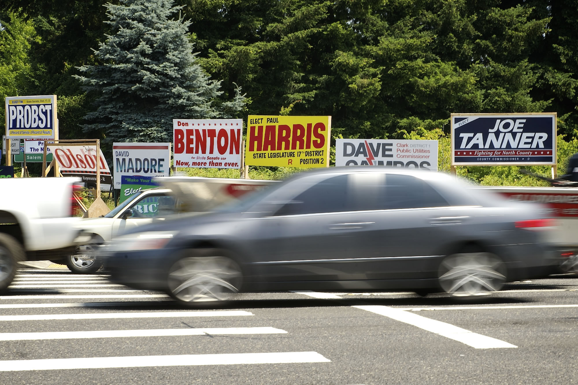
Love ’em or hate ’em, campaign signs crop up every year, sporting the usual red, white and blue color scheme, or loud colors and flashy fonts. Either way, most campaigners aim for minimalist themes with lots of contrast.
Whether new to campaigning or seasoned veterans, local candidates say their sign is an important part of their image.
One of this year’s most distinctive signs touts the candidacy of state Sen. Ann Rivers, R-La Center. The dark blue and neon green stands out from the reds, whites and blues of other candidates’ signs.
Bright colors: These are great attention-grabbers.
A minimalist design: The message should be clear and uncluttered.
Bold fonts: Use a leaning font to make a conservative campaign seem more progressive.
A simple message: People don't have time to analyze meanings as they drive by at 60 mph.
Clarity and consistency: Name and brand recognition is a must.
-- Source: Andrew Stromberg, ASK Advertising
Rivers, who is running against Democrat Ralph Schmidt, said she picked the green because it’s her favorite color.
“I believe that your political sign should be a reflection of who you are,” she said. “It’s not highly scientific, but my sign is truly a reflection of me.”
She said she never considered using red on her sign, though it is her party’s color.
“I don’t like red,” she said. “And frankly I think red, white and blue are just so overused. I think there’s something to be said for standing out from the crowd. And my sign does that.”
To help her signs stand out a little more, Rivers put reflective tape on the word “Ann” on all of her signs. This helps her name show up at night, she said.
Rivers said even her small signs overwhelm some of the larger campaign signs of other candidates.
“Every time I see my sign I still really like it,” she said.
Andrew Stromberg, owner of ASK Advertising in Vancouver, said he’s very proud of Rivers’ sign. It’s very “out-of-the-box,” he said.
Rivers was one of the agency’s first political clients, he said. While creating her sign, Stromberg said it allowed the agency an opportunity to bring something new to the table.
“We’re definitely doing stuff that’s not conventional,” he said. “We are more concerned with the full image and how it all ties together, rather than just producing a sign … In general, those who are coming to us are looking for more of a complete brand.”
The agency also creates websites and logos as part of the branding for candidates, including Rivers, Brandon Vick and David Madore.
Candidates’ requests usually go one of two ways, Stromberg said.
“They either want it red, white and blue, or they give you a little more creative license,” he said.
Stromberg said the most popular color is blue. Many people like it because it’s a conservative, business-focused color. It’s also a predominant favorite color that evokes a calming atmosphere, he said. Red, however, can be an angry color — the agency avoids using all-red backgrounds on logos and signs.
Here is what some other candidates are doing:
• Schmidt — clean and sharp: Schmidt, D-Camas, is opposing Rivers in the 18th District. He just got his signs last week, but is very pleased with them.
The signs are minimalist — dark blue writing on a white background — and Schmidt said the stark contrast makes them easy to read.
“It looks clean,” he said.
Schmidt had a couple of reasons for choosing a blue font.
“Well for one thing, I’m a Democrat,” he said. “And the dark blue looks sharper and more professional.”
The candidate said it’s vital that supporters display signs for neighbors to see.
“Yard signs, I think, are important because they announce you have a supporter,” he said. “Signs on the side of the road are more for name recognition.”
• Moeller — traditionalist: In the 49th District, veteran Rep. Jim Moeller, D-Vancouver, said his signs are relatively straightforward — blue and white with his name and slogan.
He said he didn’t choose blue because of the color’s affiliation with his party — he simply likes the color. A white-and-blue color combination is easy to read because it mimics the contrast of white and black, he said.
Moeller said if he could do it over again, he would rework his signs. They’re too text-heavy, he said. But he’s not going to change it now — the sign is a vital part of his personal brand.
“I’ve had it for 10 years and I’m going to keep it,” he said.
• Harris — vivid colors: 17th District Rep. Paul Harris, R-Vancouver, owns various paint stores, and hand-primed and painted the base coat on all of his campaign signs until this year. A local artist did the lettering, he said.
He chose his colors — yellow, red and black — because of their vividness, and no one else was using them.
“I just wanted to stand out, do something a little different,” he said.
• Lowery — signs are ugly: Rae Lowery, R-LaCenter, doesn’t have any campaign signs. The 20th District Senate candidate said she thinks the signs are ugly and litter the side of the road.
“I don’t want to contribute to that,” she said.