
I did something the other day that I haven’t done in a long time. I wrote and mailed an actual letter. Well, I should clarify that the letter was typewritten not handwritten, but still, I put my thoughts to paper, slipped the printout into an envelope, added a stamp, and dropped the whole thing into a mailbox. It felt so …old-fashioned. Nowadays most of my correspondence with family and friends happens electronically, and while I enjoy receiving and reading their emails, it’s just not as special as opening the mailbox and seeing a stamped letter sitting among the never-ending bills and credit card offers.
If I had taken the time to hand-write my letter in cursive — a skill I learned in elementary school — the experience would have been even more old-fashioned. What was once a required subject for all school-age children is now being dropped from many teachers’ curriculums. I find this rather sad, but even I have to admit that my handwriting, so carefully taught to me through hours of repetitive exercises, has become what I like to call “prinsive” — an amalgam of printed and cursive letters.
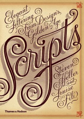
Even though my penmanship has turned away from the elegant curves and loops of true cursive, I still appreciate beautiful lettering. That’s why I thoroughly enjoyed looking at “Scripts” — a tribute to 19th and 20th century script typefaces. What is a script typeface? According to the online encyclopedia Wikipedia, script typefaces “are based upon the varied and often fluid stroke created by handwriting.” While examples of script typefaces are still used today, ornate typography experienced its golden age from the early 19th to mid-20th centuries. High society kept printing shops quite busy filling orders for personal and formal announcements of births, weddings, and anniversaries. Calling cards were once de rigueur for anyone of note, and of course, an elegant typeface spoke volumes about the card bearer’s refinement. But business also contributed to the increased demand for script typefaces. In the introduction to this week’s book, the authors explain that “scripts gave the illusion that the business name was a signature. They made the impersonal personal.”
Within the pages of “Scripts” you’ll discover numerous examples of French, British, German, Italian, and American advertisements, business papers, letterheads, magazine and sheet music covers, etc. using elaborate scripts. All are wonderful illustrations of bygone times, when grace and elegance dominated society, when communication had nothing to do with clicking, tweeting, or blogging. Such beauty might even inspire you to compose a handwritten missive to your loved one. Don’t fret — cursive is optional.
Jan Johnston is the Collection Development Coordinator for the Fort Vancouver Regional Library District. Email her at readingforfun@fvrl.org.
