-
Grab a stack of paint chips from the store and take them home with you. Fan them out and weed out the ones that don’t appeal.
-
Stand in the mirror and hold paint chips near your face. Some, especially those with too much blue, don’t complement skin tones.
-
Buy a sample can and paint a test board. Move it around the room at different times of the day to make sure it’s what you like.
Hard times call for soft colors.
Although Pantone recently proclaimed Emerald its gem of 2013, American paint companies chose soothing pastels as their go-to hues for the new year. For Sherwin-Williams, it’s Aloe, a minty green with a 1950s vibe. Benjamin Moore selected Lemon Sorbet, a citrus shade slightly brighter than cream that also has a nostalgic look.
“Now we yearn for colors, designs and simplicity of the past,” says Sonu Mathew, senior interior designer for Benjamin Moore. “It’s not only a softening of the palette, but a softening of the lines in design. There’s more tactility in fabrics and surfaces. We’ll find things that shimmer and shine next to things that are dead matte.”
So perhaps “contrast” should be the design word for 2013, because it applies to texture and color. These pastels won’t look wimpy; they’ll be paired with edgier brights and deep saturated colors. Aloe with chartreuse and coral, for example. Lemon Sorbet with peach and raspberry, Mathew says.
“It’s this partnering of extremes that catches our eye in 2013.”
Color trends in recent years have seen richer, darker, more saturated and jewel-toned colors on walls and in furniture, as well as in accessories. 2013 will see more lighter pastels.
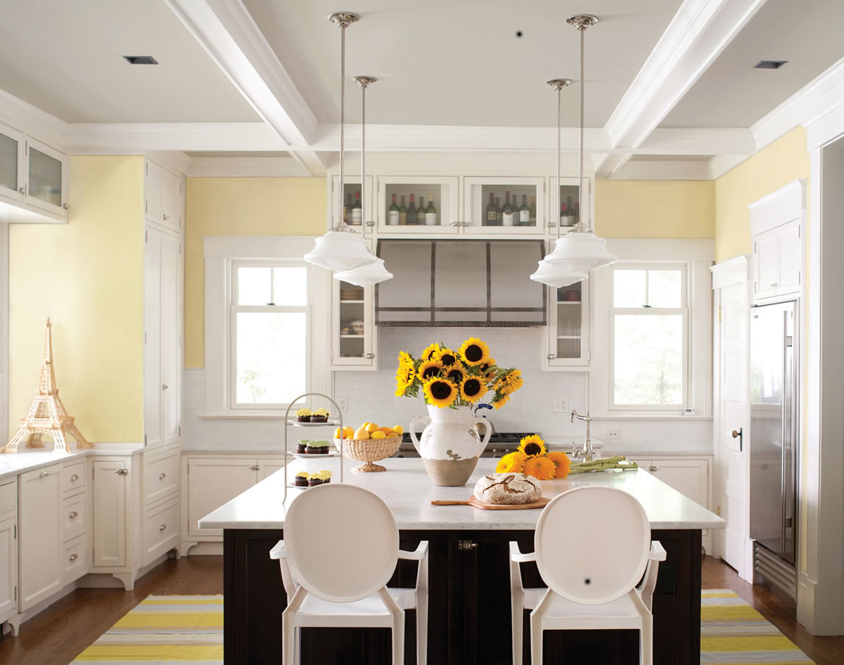
Lemon Sorbet
The thought behind the color: Yellow always has represented optimism, “and as the world seems to be gradually turning the corner on recessionary times, this whispery tint of the color is timely and evocative of the uptick,” says Mathew.
This shade of yellow works as an economical neutral.
“We are certainly redecorating, but in smaller ways,” Mathew says. “We are celebrating the idea of reusing or reinventing what we have, rather than starting from a completely blank canvas.”
How to use it: Mathew says those who want to repaint should create a palette of three to five colors for their home, and allow one or two colors to take the lead in each room or space. Many rooms can be Lemon Sorbet, which can serve as a backdrop for striking color.
Or, in a gray room, Lemon Sorbet could be used on the ceiling for an unexpected punch. It also could be used to paint chairs, tables or bookcases for pops of welcoming color.
Best bet: The kitchen.
Other good spots: Dining room and playroom.
How Kansas City designer Lisa Schmitz is using Lemon Sorbet: “We are currently working with a color palette containing a soft yellow like this,” she says. “While Benjamin Moore shows it as the main color in rooms, we are using it as an accent with warm gray and muted gray-purple. The soft yellow adds brightness without being too bold.”
Schmitz says the room will include yellow draperies against sophisticated gray walls, and wing chairs in stripes of yellow, gray and cream. Metals of antique brass and bronze continue the balance of warmth against the cooler gray. The softness of this palette remains a somewhat neutral background to a bold art collection.
Aloe
The thought behind the color: Like Lemon Sorbet, it’s a pastel — a nostalgic nod to the mid-20th century. Sherwin-Williams chose the hue “with a hint of mint and lots of moxie” following sneak peeks of fashion and European design shows.
Designers are digging this shade of green. The Kate Spade brand is pairing it with coral. In a recent interview, designer Jonathan Adler says the green color of Claridge’s luxury hotel in London — reminiscent of Aloe — is his current fave.
“This is no ordinary pastel — Aloe is funky and glamorous, demure and free-spirited,” says Jackie Jordan, Sherwin-Williams director of color marketing. “While Aloe’s vibe can verge on retro, when paired with caviar blacks, crisp whites or soft grays, suddenly Aloe has a new soul and attitude.”
How to use it: As an entire wall color. “You can go in so many directions with it,” Jordan says. “I chose this color for so many reasons. It has great exuberance, it’s youthful and optimistic. It’s also soothing.”
For a tranquil aesthetic, Jordan recommends using Aloe with natural textiles, tarnished metals and warm wood tones in light to medium finishes. For an energetic look, she suggests combining Aloe with vintage chartreuse, floral lilacs and vivid corals.
Best bet: A bedroom or bathroom — the tub area only. “I’d steer clear of the sink area,” Jordan says. “It’s probably not the best color for skin tones.”
Other good spots: Dining room with modern black and white accents or a gender-neutral nursery. “It could have periwinkle and lavender accents to make it feminine, yellows and grays for masculine,” Jordan says.
How Kansas City designer Lisa Schmitz would use Aloe: “In bathrooms and kitchens, Aloe is beautiful set against Carrara marble and stainless steel,” she says. “Hot pink or coral make lovely accents without harking back to the pale pink accents of the 1950s.”