We’ve all been there.
You decide to paint a room, and weeks later, your walls are a crazy quilt of paint swatches. You’ve flipped through rooms on Houzz and Pinterest and virtually painted your room online. You’ve asked your friends and your plumber for their opinions. You are still afraid to make the wrong choice.
It’s OK.
Consumers typically try three to five paint colors before deciding on their final selection, according to Erika Woelfel, Behr’s director of color marketing. Of course, many try even more.
Perhaps everyone should accept the fact that painting a room is sort of like becoming an artist. Painting is a process, whether you are agonizing over the color selection or actually brushing the paint on the walls. “You are the artist of your own environment,” says Barbara Richardson, color marketing manager for Glidden Paint. “You shouldn’t be afraid to experiment and then adjust and tweak.”
Nervous homeowners can find help from designers, architects and color consultants, as well as apps. Valspar’s new Color Connect app for iPhone and iPad connects folks to color consultants for a live or email exchange. You can chat with a consultant on live video about the merits of Indigo Cloth vs. Night Scape for your powder room.
“We find that consumers need the voice of affirmation that the color they chose is the right one,” says Sue Kim, Valspar color strategist. “We can narrow them down together.”
Not feeling like Monet yet? Read on. We want to help jump-start your spring painting projects. Here are five paint experts with their five best painting tips.
Color selection
Zoe Kyriacos is an architectural color consultant. She advises clients of her Takoma Park, Md., firm, Colors by Zoe, on paint colors for interiors and exteriors. Here are some of her pointers.
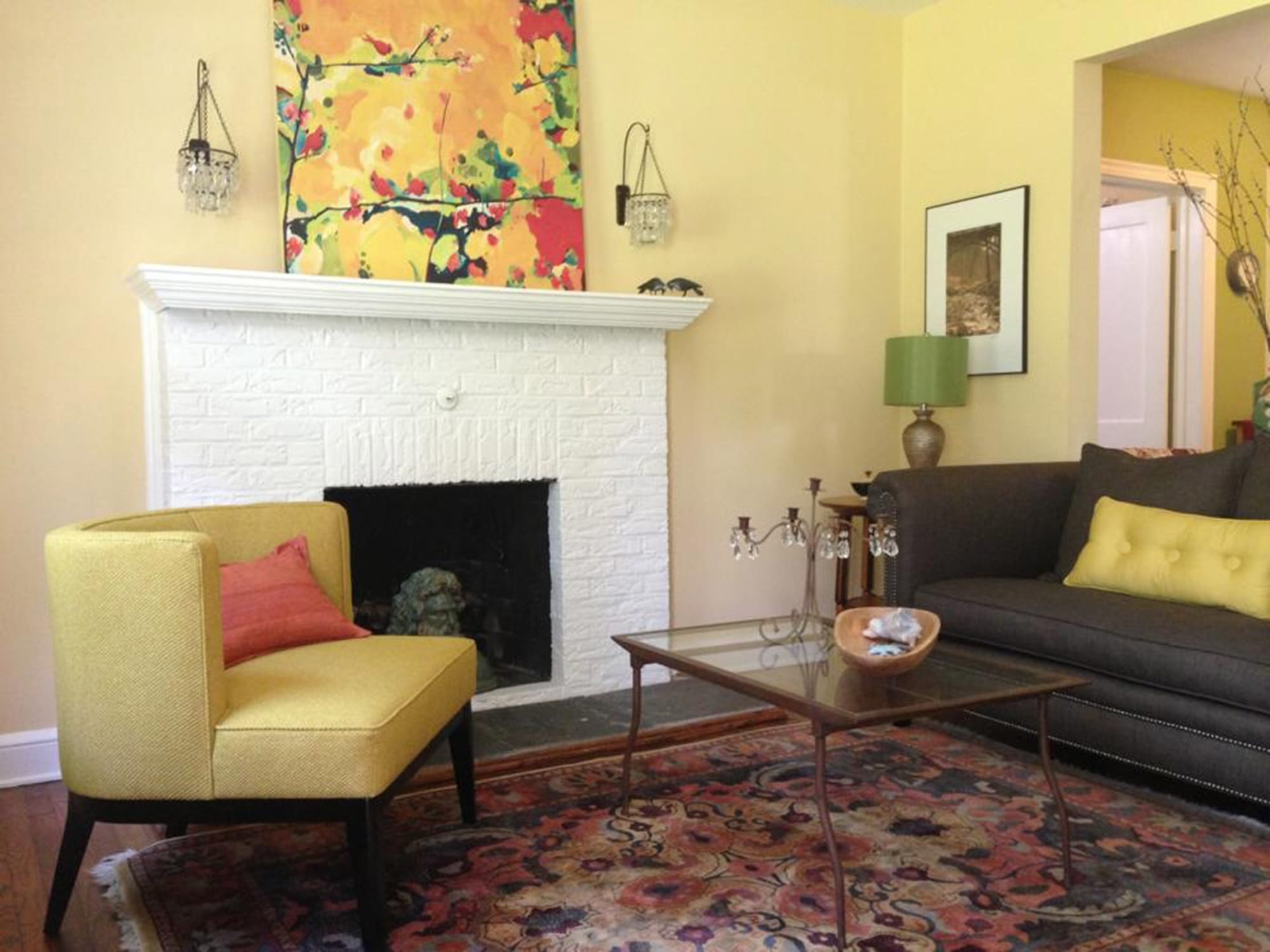
Consider the existing items in your room. Flooring, rugs, artwork and upholstery will suggest a color direction. Try to pull together these elements in your color choice. If your home is not furnished, make the paint color the last thing you choose; there are thousands of colors to choose from but maybe only one rug that you really love.
Take your paint samples home. Colors you select in the Home Depot aisle will look different under the lighting conditions in your home.
Don’t examine a paint sample against a white wall. Color is affected by what surrounds it, and putting a sample on a white wall will cause it to appear darker than it really is. This results in many people making a choice that is too light. Put the paint sample against a sofa, wood furniture or flooring for a better perspective.
Take into account how color flows from room to room. If you have a modern house with an open floor plan, it’s important to use one wall color throughout the main floor. Add accent colors in a few carefully considered areas.
Stick with white trim in most cases. Try several whites before you make a final selection. Benjamin Moore’s Simply White works well with cooler shades such as blue, gray, purple and pink. Warmer wall colors, such as yellow or green, call for a softer white, such as Benjamin Moore’s Mayonnaise.
Room colors
Washington designer Elizabeth Hague has been known for her calm and classic interiors since she opened her firm in 1991. She shared her go-to paint colors for five different rooms and the reasons why she likes them.
Living room: Benjamin Moore Soft Chamois. This pleasant clay color is a neutral backdrop for textiles, furniture and accents.
Dining room: Farrow & Ball Cornforth White. This dark, warm gray has a lot of pigment in it, which makes it rich and beautiful in candlelight.
Kitchen: Farrow & Ball Blackened. This chalky blue serves as a nice contrast to natural stone countertops, cabinets and polished-nickel fixtures.
Bedroom: Pratt & Lambert Smoke Ring. Choose a beautiful color to wake up in, such as this periwinkle blue-gray. It’s the color of sky on a clear day.
Bath: Pratt & Lambert Full Moon. To go with natural stone flooring and countertops and polished nickel fixtures, choose a shade with warm gray-green tones, such as this off-white.
Special finishes
Denise Sabia, a decorator from Ambler, Pa., writes about paint on her blog, the Painted Home (www.paintedhomedesigns.com). She is an expert at giving flea market furniture and accessories a fresh look, often with specialty finishes. We asked her to discuss some of these popular products.
Chalkboard: There are lots of possible applications for chalkboard paint, and it makes a great conversation piece, whether on drinking glasses, bedroom walls, tabletops or drawer fronts. It’s great in the kitchen for grocery lists. Favorite brand: Rust-Oleum Specialty Chalk Board.
Chalk: Chalk-finish paint (not to be confused with chalkboard paint) dries quickly and adheres to almost anything. This creates a chalky finish that sands down to a super smooth surface. There is also limited prep work besides cleaning the piece with a paper towel and Simple Green spray. Favorite brand: Annie Sloan Chalk Paint.
Metallic: Metallic paint is a bold look that should be used sparingly. Use it as an accent on the edges of furniture or on accessories to add a little shimmer. Favorite brand: Martha Stewart Living Metallic Paint.
Milk: Milk paint is the perfect solution if you are looking for the chipped, timeworn look. It can flake off furniture when it dries to appear vintage. Favorite brand: Miss Mustard Seed’s Milk Paint.
Mirror: There is a lot of interest these days in mirror-finish spray for home accessories. You can apply it on Mason jars or other accessories to create a sort of mercury glass look. It adds a layer of instant charm. Favorite brand: Krylon Looking Glass Mirror-Like Paint.
DIY
Richardson, the color marketing manager for Glidden Paint, helps consumers choose and apply paint wisely. Here are her tips on how to avoid stress while painting:
• Pour paint into a smaller container. It’s more practical to carry around the paint you need in something smaller and lighter than an unwieldy gallon can. You can use a container you have on hand, or buy a small container with a handle at many paint stores. This is particularly helpful when working on a ladder.
• Carry a wet cloth. If you drop paint on something, you can quickly wipe it off without having to stop and gather cleaning materials.
• Wear an apron. A canvas painting apron or a durable cook’s apron with pockets provides storage for all the things you’ll want to have around you: an extra paintbrush, your phone or that little wet cloth for spills. Over time, the apron becomes a sort of color library of your home, because splashes of paint from each project will inevitably end up on it.
• Invest in a good-quality brush. If you buy an inexpensive brush, you’ll be annoyed at how much time you’ll have to spend picking bristles out of your paint job. Ask for a recommendation at your hardware store or paint shop; Wooster brushes are often used by pros. If you’re using a water-based paint, clean your brush by wiping it with a newspaper or rag and then soaking in lightly soapy water.
• Consider painting trim and ceiling the same color as your walls. If you choose a neutral color for a main room of the house, painting the trim and ceiling the same color can create a unified look. This is especially helpful if you are going for a more modern or contemporary feel.