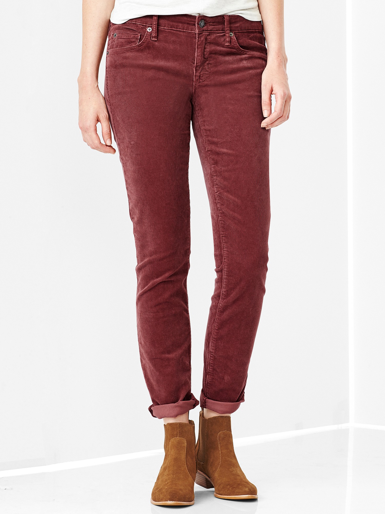
Take a look inside that bottle of Marsala wine sitting in your bar you once bought for that Italian chicken recipe. That earthy, reddish-amber color is what Pantone has named its 2015 Color of the Year.
Marsala “enriches our mind, body and soul, exuding confidence and stability,” says Leatrice Eiseman, executive director of the Pantone Color Institute, in the announcement.
Unlike other “Colors of the Year” put out by paint companies, Pantone’s color forecasts are used across many industries besides home design and interiors, whether fashion, consumer products, graphics or packaging. As a major color authority, Pantone charts corporate color direction. So what made it go with Marsala? Pantone officials say the color is already big in clothing, handbags and wearables. And they believe it goes well with warmer taupes and grays, and umber, golden yellow and turquoise.
So what do color experts think of Marsala?
“It’s nice, but it surprises me,” says color consultant Jean Molesworth Kee, owner of the Painted Room in Alexandria, Va. “We have been veering from red or burgundy wall color now for years. This has a dusky, earthy quality.” Kee says she could see Marsala used in “an ethnic bohemian place.” She added, “It’s muted and it reminds me of Morocco or of faded old Oriental rugs. It would go nicely with warm, sandy colors and browns.”


