
Stop panicking: It’s really just light red.
No other color gets dissed and dismissed as often as pink when it comes to home design — unless we’re talking baby girls’ rooms. Yet in home decor, shades of pink have circled through a number of decades, often in tandem with other colors — gray, chocolate, navy and preppy jade green.
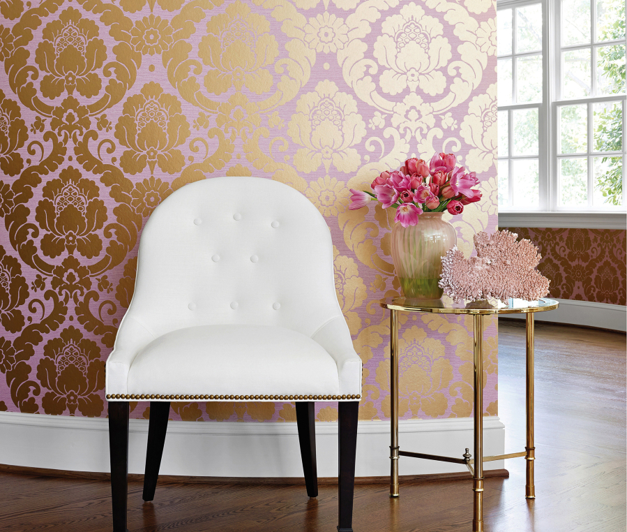
For the past three years or so, pink has been re-emerging in Europe. More precisely, beige-y blush kept cropping up in upholstery and even cabinetry at the Maison & Objet shows in Paris. Not uncommon in Scandinavian countries, pink easily streamed into housewares as well, with whisks, salad utensil sets and peelers. Variant shades like petal, carnation and even deeper rose started inserting themselves into fabrics and cabinetry. Attractive mixable metals like rosy copper or pink-toned glass or quartz are showing up in lighting, tabletop and accessories.
“To most consumers, pink is associated with a child’s room,” says Ann Haagenson, divisional merchandise manager for Anthropologie. “So it has taken a while to progress into the living room and master bedroom.” The retailer is selling bedding, lighting and votive holders in the color. “But blush or ‘biche’ (fawn in French) is the most flattering color for the home. It makes everyone and everything look pretty. It’s also the most neutral color, outside of creme, so it’s easy to use in a totally new room design or to integrate into an existing one.”
Stacey Senior, marketing director for fabric/wallpaper manufacturer Thibaut, says the color can make a room feel more feminine — with a surprising impact. “Blush pink/quartz is very refined,” says Senior, “and instantly changes a room’s mood to sophisticated and pretty. It is a complementing color to brassy gold and sharp white tones. Integrating pink into an already furnished room is easy with accessories and peek-a-boo accents like throw pillows or picture frames. As a main color, going bigger is better — like pink wallpaper or a rug.”
