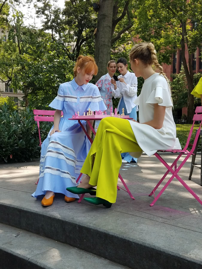
NEW YORK — Cherry tomato, chili oil, lime punch and coconut milk typically belong in the kitchen — but come spring, they’ll be color staples in your closet.
Timed with New York Fashion Week — underway this week in New York City — color experts at Pantone released their picks for the season’s top shades. In addition to the foodie hues, meadowlark (“confident and outgoing” bright yellow), little boy blue (think azure blue), pink lavender, blooming dahlia (a soft pink-ish hue), arcadia (cool, clean green with a blue undertone), ultra violet, emperador (a rich brown), almost mauve and spring crocus.
If those aren’t enough options for your warm-weather wardrobe, Pantone also unveiled its “classic color palette” for spring 2018. Those shades are sailor blue (navy), harbor mist (mid-tone dove gray) and warm sand (a neutral tan).
Look for an influx of these colors in stores early next year. In the meantime, you’ll have to stick to your pantry to see them!


