
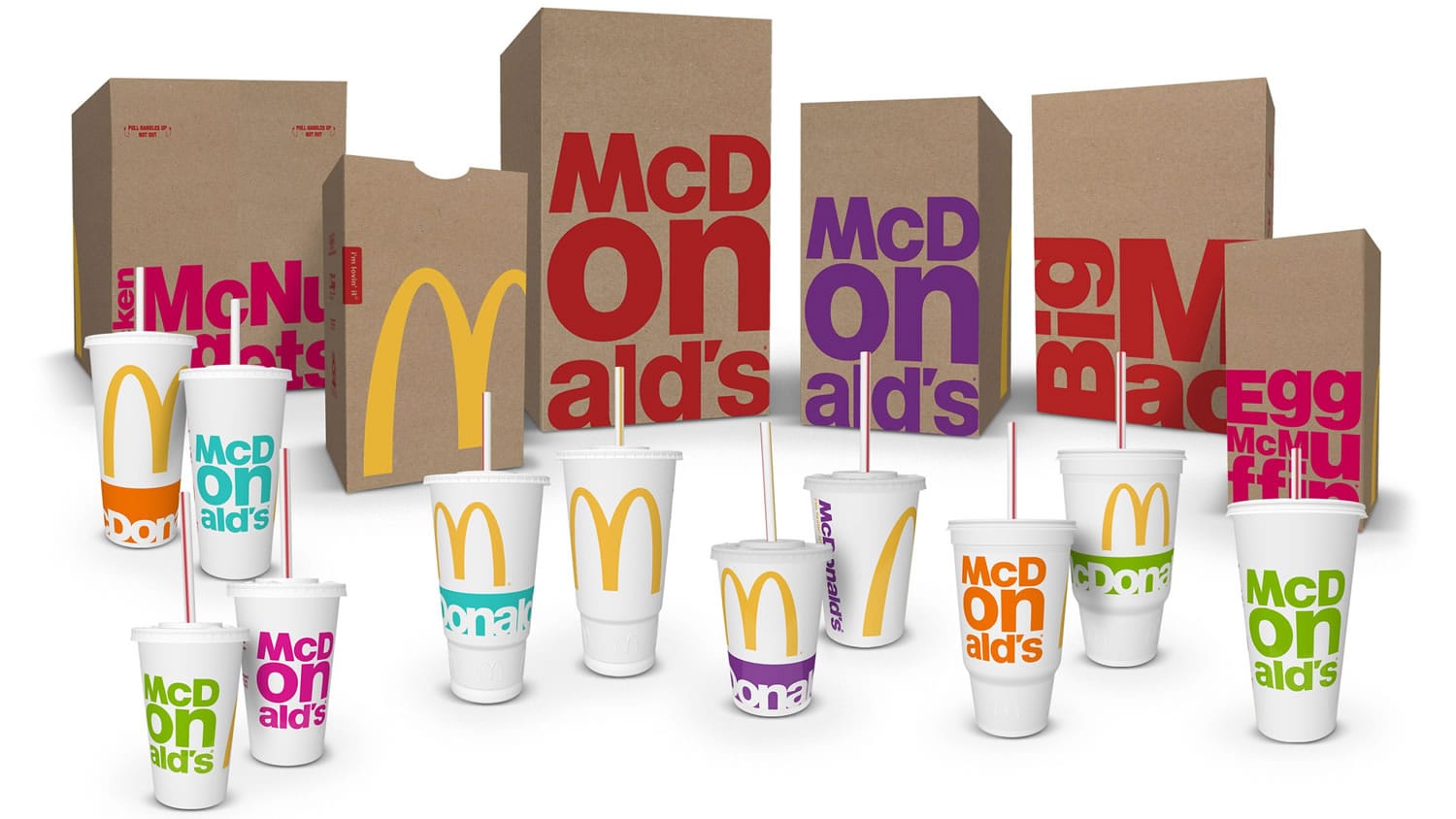
CHICAGO — First McDonald’s worked on its food. Next up for its nearly yearlong face-lift is a revamp of its boxes, bags and cups.
The world’s largest burger chain will roll out to its 15,000 U.S. restaurants this month new bags, cups and sandwich containers featuring a graphic design it hopes will attract millennials, the fastest-growing segment of the U.S. population. It’s aimed at a generation that appreciates design, but also demands simplicity because of the constant distractions of smartphones and other technology.
The new packaging is part of an effort to get a consistent brand experience in stores, drive-thrus, kiosks and on McDonald’s mobile app, said Matt Biespiel, McDonald’s senior director of global brand development. McDonald’s, based in suburban Chicago, launched its mobile app and started rolling out “Create Your Taste” custom burger kiosks in restaurants last year.
It’s the first major packaging redesign since 2013.
The designs are simple yet bold — a combination that McDonald’s says reflects the leadership of CEO Steve Easterbrook, who has been in the top job for nine months. Under his watch, the company has reported its first U.S. same-store sales improvement in two years, launched all-day breakfast, introduced a new “McPick2” value menu and stripped poor-performing items off its menus. It has simplified operations to get food ready faster and made tweaks to improve quality, such as toasting buns longer, changing how burgers are seared and switching to butter from margarine on Egg McMuffins.
