Cool colors include blue-green, violet, pastel pinks and lavenders. Even a light, creamy yellow can be a cool color. Cool colors create an atmosphere of relaxation. They tend to blend with rather than stand out from surrounding greenery.
White and other light colors that reflect light are good choices where night lighting is used.
White combined with any other color is always a good combination.
One of the most pleasing schemes is monochromatic. That could mean a bed of red petunias. It could also mean several shades of the same color such as light to deep pink or blue. Another almost monochromatic color scheme includes shades of two colors right next to each other on the color wheel such as blue and lavender. Sometimes white or a compatible dark shade is added to shades to give definition or contrast. For example, crimson added to shades of pink or purple added to shades of lavender.
Complementary colors, that is, those on opposite sides of the color wheel, are very pleasing contrasts to most viewers. Some of our traditional holiday colors are complementary. Green and red, purple and yellow, and orange and blue are examples. Near complementary colors are also pleasing. For example, blue and yellow or pink and violet blue.
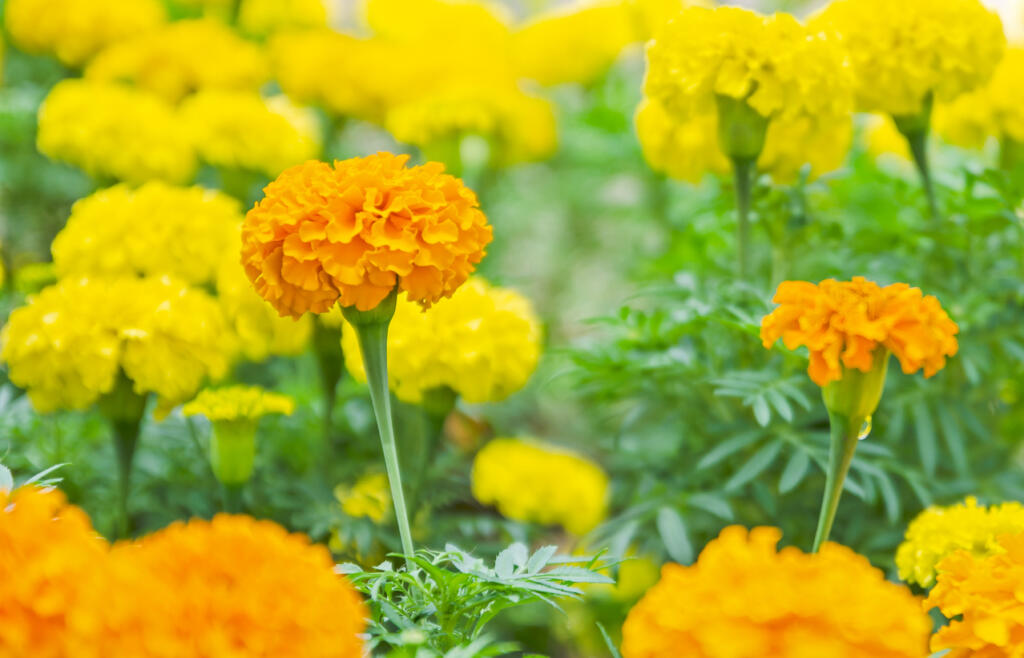
Certain color combinations are often jarring to most viewers. Oranges and bright yellows usually do not combine well with bright reds and pinks. These colors tend to fight for attention when placed right next to each other. On the other hand, simply placing a neutral white or silvery gray between two strong colors may remove the sting.
Complete mixtures of color can also be effective. The full range of flower colors in a single species are usually quite compatible. Incompatibilities sometimes arise when mixtures from two or more species are combined. When you combine a mixture of marigolds with a mixture of petunias, the effect can be quite jarring. On the other hand, a mixture of snapdragons or begonias has good color compatibility with a mixture of petunias.
So, why not try some different color combinations this year?


